Portfolio Sections
A. Final Product: Main Product
(1)
B. Final Product: Ancillary Texts
(2)
C. Evaluation Question 1
(1)
C. Evaluation Question 2
(3)
C. Evaluation Question 3
(1)
C. Evaluation Question 4
(1)
D. Appendix 1: Research For Main Product
(15)
E. Appendix 2: Pre-Production Planning For Main Product
(6)
F. Appendix 3: Research For Ancillary Texts
(10)
Tuesday, 1 February 2011
Monday, 31 January 2011
How did you use new media technologies in the construction and research, planning and evaluation stages?
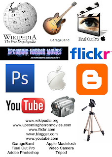 I have created the whole of my project using cameras, computers and websites in college. To the left are the various websites and programmes that I used to create various parts of my coursework and each of them bought their own advantages and disadvantages.
www.wikipedia.org - This was probably the least influential of all websites, but it provided me with information about various films in my research stage particularly when I made notes about "The Exorcism Of Emily Rose" in my research for my main project (Post D)However, I didn't want to rely to heavily on it as anybody in the world can edit the page an information can often not be accurate.
www.upcominghorrormovies.com - I used this for pretty much finding out about upcoming horror films, I used a list of these on one of my ancillary texts (Post B) as well as a list of upcoming horror films posted separately (Post D)
www.flickr.com - Used not only when I was analysing current horror posters and magazine covers (Post F) but when I was analysing the first draft of my ancillary texts (Post F) Not only could I share my ancillary text images with the world but I could highlight particular points on the image and identify the conventions of the horror genre present.
www.blogger.com - This is clearly the most important part of my coursework, even though it didn't really help me to produce my trailer or ancillary texts. One of the advantages of putting all my work onto a blog is that it easy to publish; all you need to do is type, you can delete and edit posts very quickly, you don't have to look after a paper and keep it with you all the time, and you can access it from anywhere so there would be no excuse for not finishing my evaluation on time! Another advantage to the blog over coursework on paper is that people can comment on your posts. This was particularly useful when getting feedback from staff as all they need to do was comment on a post instead of arranging to meet and discuss how to improve it. Another advantage is the fact that you can add anything to your blog; you can make it your own and make it suit to your personality. Although this is not vitally important it helps t make people think you care about what your doing and you are enjoying personalising your coursework. Potential disadvantages to this are that anybody can see you work anytime, they can get ideas from your posts, which although is generally a good thing, it means that someone could be using similar ideas and sentences. Another disadvantage is that, if you have never used a blog before, although, it's not that hard to use, it take s a lot more brains to change the design and fonts and make it look pretty.
www.youtube.com - Where would we be without YouTube? We uploaded the first draft and final draft of our teaser trailers onto the website to transfer onto our blogs. The advantage of YouTube is that anybody can view our work, leave comments, ratings and are allowed to 'like' or 'dislike' our video. This can help us in our audience feedback for our trailers. So far, we have only received 26 viewings of our draft and 20 viewings of our final project and nobody has left comments yet. However, the possibility is there but it would require me encouraging people to go to the site to view it.
GarageBand - This is a programme on the Apple Mac, it allowed our group to create original sounds, create soundtracks and put them on top of our trailer although it took some getting used to, as at least half of our group were unsure how to use it at the start but slowly began to get to grips with the programme.
Final Cut Pro - This is the main programme on the computer that we created our teaser trailer with. Although it took some getting used to and although we had to play around and learn how to use it effectively, it was crucial in creating the main part of our coursework. It allowed us collect the various shots of the video camera, add them together, delete parts of shots, speed up or slow down shots and create our own graphics such as the text in between the shots.
Adobe Photoshop - This was the main programme that I used to create my ancillary texts. It allowed me to put together pictures, as well as change the colourings and opacity of them and add text and colour to the document to create both the promotional poster and the magazine cover. Again, although this took some getting used to, it is fairly easy to use and when creating something as simple as a poster, you do not need to know the programme back-to-front to produce a good piece of work.
Apple Mac, Video Camera, Tape and Tripod - Some of the programmes that we used were exclusive to the Apple Mac, and although, compared to the usual Microsoft Windows it seemed very confusing, it allowed it to create the majority of our coursework. The video camera, tape and tripod, were kindly lent to us by the college in the time that we needed to shoot for our teaser trailer and all three of the items were not particularly hard to use. The only thing we needed to look out for when shooting was that we didn't record over shots we had already shot!
What have you learnt from your audience feedback?
It is important, when creating an advertising campaign for a film, to get audience feedback along the way. It ensures that we are able to make sometimes subtle changes to our work that we might not have noticed as well as other bigger things that perhaps don't make sense to other people. This is similar to that in a real advertising campaign. It is important for a company to get regular feedback on their work so not only can they improve it but so it is suitable to their target audience which is crucial for particularly small companies. Although it is not as important with the work we are doing in class!
After we had created our first draft for our teaser trailer, we screened it to the class in order to get some constructive feedback as well as to find out the things that worked well. We handed out feedback sheets for the class to fill in and give us information about how the trailer stuck with the typical conventions of horror trailers and how effective they were as well as things that could be improved. Another way of getting feedback from people who aren't our age was to ask family members to watch the trailer on YouTube and tell us what they thought of it, this ensured that we got various viewpoints from both male and female as well as a variety of ages.
After the first screening of our trailer to the class and after analysing the audience feedback, the biggest fault that we found in it, which we struggled to correct was that the narrative was not clear, which although we didn't want to give too much away of the plot, we wanted the class to know what was happening. Another criticism of the trailer was that some shots seemed a bit pointless or confusing, such as the "washing up" shot and the "crawling" shot although we later decided that the crawling shot was necessary in the understand and the scariness of the trailer so didn't delete it. Other criticisms of the first draft included, low variety of shots, off-beat and ineffective music, the low speed of the trailer as a whole, and snippets of talking between shots that as a group, we hadn't noticed. Most of these criticisms we acted on which gave us a much better looking, faster, less confusing, scarier trailer.
From our audience feedback we felt it was important to give people a chance to say what they thought was good with our trailer. A few people commented on some of our best individual shots such as the "mirror" shot or the "gate" shot at the end plus the establishing shot at the beginning as well as the use of lighting in most if not all shots and how it stuck with the typical conventions of horror trailers. Other positive feedback included the use of our sound and how it kept the tension building, the sudden loud sounds such as the scream to end the faster selection of shots as well as the acting skills of our 'professionally trained' actors and actresses!
This is not forgetting the other less substantial feedback I constantly had from the teacher (SMa) allowing me to improve my ancillary texts and make them stick by the genre conventions as closely as possible.
Video Links (Click to access):
Cell 17 First Draft (Post E)
Cell 17 First Draft Audience Feedback Summary (Post E)
Cell 17 Final Teaser Trailer (Post A)
How effective is the combination of your product and ancillary texts?
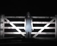
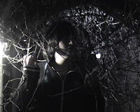 When making our trailer, poster and magazine cover we had to ensure that there was a brand identity evident. From the trailer, I selected three key images to use on the poster and magazine cover to ensure a brand identity. We also tried to use dark colours and those which are conventional of the horror genre such as black, white, red and blue. For the sake of establishing a brand identity, I also stuck with the font "skribble" for my poster and magazine cover. Two of the three images that we used throughout to create a brand identity are to the left.
During the process of creating our trailer and ancillary products we had to ensure we understood the function of film distribution. The distributors play a key role in ensuring the target audience knows about and wants to see the films they promote. The first role of a distributor is to identify the target audience. This obviously needs to be clearly established before the outset of creating the marketing campaign. Our project was to make an advertising campaign for a horror film. Through our research we decided that the target audience would be 17-24 year olds which is why we decided on the classification 12A. Once we had established the age group, we conducted research into the target audience and what type of films they would like to see and the type of horror that would appeal to them, we did this by publishing questionnaires and getting people, mostly between the ages of 17 and 24 to fill them in with information that we could use about horror films and useful modes of advertising. For our audience survey results go to Post D.When we had discussed our target audience, their interests and tastes, we had to think of how we could promote our film as we would use various mediums to reach them. As a lot of people in their late teens and early twenties would be on the internet on various popular sites we decided that in order to get some feedback for our first draft and final draft we would publish our videos on YouTube. We also created our magazine cover to ensure that it was seen by the typical audience of Total Film magazine. I ensured that while I was creating each product, I was getting regular feedback, from various people to ensure that, the products would be suitable for the target audience.
When we created our trailer it was then important to decide a release date, we decided on Friday, 28th January. We thought January would be a good time for our target audience to get out from doing work and exams at the beginning of term to go and watch a film. On average, there are ten films are released every week in Britain and we thought that we would avoid the peak times of pre-Christmas and summer to avoid too much competition. It is a Friday to fit with the general conventions of film releasing.
When we created our trailer it was then important to decide a release date, we decided on Friday, 28th January. We thought January would be a good time for our target audience to get out from doing work and exams at the beginning of term to go and watch a film. On average, there are ten films are released every week in Britain and we thought that we would avoid the peak times of pre-Christmas and summer to avoid too much competition. It is a Friday to fit with the general conventions of film releasing.
In what ways does your media product use, develop or challenge forms and conventions of real media products?
Teaser trailers are important in terms of advertising and marketing when creating a new film. They are created by the distribution companies to encourage the potential target audience to see the film. Therefore, it is important to make it suitable for the genre, for example, if it's a horror trailer, it's quite important to add things that will make it scary or mysterious to watch. It also needs to give you a flavour of the plot, and some of the main characters, although it shouldn't give too much away. When creating our trailer, it was important to try and stick to the main conventions of a horror trailer and to make sure it would persuade the audience to come and watch it. Conveying a sense of mystery is important in this.
Teaser trailers are very important in making money, as persuading people to come and see it makes more money, it should not only inform people of the latest new film but should persuade people to come and see it. After all, much of the time, the only way you hear about a new movie is from the trailer so it needs to be good.
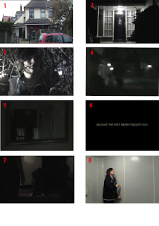
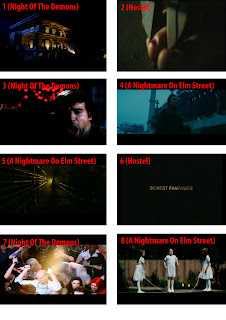 The images to the left show nine screen shots of our final teaser trailer along with nine similar shots from other various horror trailers. The first shots on each of the posters (labelled 1) were towards the beginning of the appropriate trailers and established the setting of the horror trailer. Our trailer started off light which soon then turned to darkness, the doorway of our house looks a whole lot scarier in the dark even though we had just seen a similar thing in the light which appeared to be Innocent. This is similar to the shot (labelled 2) in Hostel, something which under a different light or a different angle may appear to be Innocent is in fact something completely different and quite scary. When studying various trailers, we found that it is always important to include shots of the characters looking scared (often as a close-up) to terrify the audience and show emotion. Hence the shot on each poster labelled 3. Shots 4 and 5 on each poster signified clever camera movement, sometimes it is appropriate to pan or to include a handheld camera shot to convey the scariness of the situation. Shot 6 signifies inter-titles are often used to help the narrative along in the trailer and is almost crucial in a horror trailer to help understand the plot and to give a strong suggestion of the sub-genre of the film. The shots labelled 7 are stills of a fast compilation of shots in the trailer. It is important that a horror trailer goes through at least one pacy bit to build up suspense often to a climax of a big scary shot or loud noise. The last two shots (labelled 8) on their own don't look as if they should belong in a horror trailer. Sometimes it is good to include well lit shots that don't seem necessarily scary at first glance, this often helps to build a sense of mystery or innocence.
In our trailer we attempted to make our sound as scary as possible. We decided not to use any dialogue in the trailer but simply inter-titles to get the point across. This is similar to typical horror trailers because a lot of the time people's voices make the trailer a lot less scary and comforts you even though there may be terrible murders going on in the background! We developed our sounds in Garageband and a substantial amount of our sound was created by a pretend keyboard, although this doesn't seem particularly scary to read, if it is played in the right way, it can create tension and build the trailer to a climax. There is also undertones of a solid sound underneath the trailer which ensured that there were no silent moments in the trailer as this would not be sticking by the conventions of normal trailers. And of course, the scream - we had to include a scream in our trailer, most horror trailers that we have looked at in class included someone screaming, often female and occasionally a very short period of silence for effect, however we kept with a solid undertone after the scream to ensure that people didn't think it was all over!
Teaser trailers are very important in making money, as persuading people to come and see it makes more money, it should not only inform people of the latest new film but should persuade people to come and see it. After all, much of the time, the only way you hear about a new movie is from the trailer so it needs to be good.

 The images to the left show nine screen shots of our final teaser trailer along with nine similar shots from other various horror trailers. The first shots on each of the posters (labelled 1) were towards the beginning of the appropriate trailers and established the setting of the horror trailer. Our trailer started off light which soon then turned to darkness, the doorway of our house looks a whole lot scarier in the dark even though we had just seen a similar thing in the light which appeared to be Innocent. This is similar to the shot (labelled 2) in Hostel, something which under a different light or a different angle may appear to be Innocent is in fact something completely different and quite scary. When studying various trailers, we found that it is always important to include shots of the characters looking scared (often as a close-up) to terrify the audience and show emotion. Hence the shot on each poster labelled 3. Shots 4 and 5 on each poster signified clever camera movement, sometimes it is appropriate to pan or to include a handheld camera shot to convey the scariness of the situation. Shot 6 signifies inter-titles are often used to help the narrative along in the trailer and is almost crucial in a horror trailer to help understand the plot and to give a strong suggestion of the sub-genre of the film. The shots labelled 7 are stills of a fast compilation of shots in the trailer. It is important that a horror trailer goes through at least one pacy bit to build up suspense often to a climax of a big scary shot or loud noise. The last two shots (labelled 8) on their own don't look as if they should belong in a horror trailer. Sometimes it is good to include well lit shots that don't seem necessarily scary at first glance, this often helps to build a sense of mystery or innocence.
In our trailer we attempted to make our sound as scary as possible. We decided not to use any dialogue in the trailer but simply inter-titles to get the point across. This is similar to typical horror trailers because a lot of the time people's voices make the trailer a lot less scary and comforts you even though there may be terrible murders going on in the background! We developed our sounds in Garageband and a substantial amount of our sound was created by a pretend keyboard, although this doesn't seem particularly scary to read, if it is played in the right way, it can create tension and build the trailer to a climax. There is also undertones of a solid sound underneath the trailer which ensured that there were no silent moments in the trailer as this would not be sticking by the conventions of normal trailers. And of course, the scream - we had to include a scream in our trailer, most horror trailers that we have looked at in class included someone screaming, often female and occasionally a very short period of silence for effect, however we kept with a solid undertone after the scream to ensure that people didn't think it was all over!
Sunday, 30 January 2011
Posters and magazine covers that influenced me
The posters and magazine covers below were the main designs that influenced me on using particular words, phrases, information, colour design and general layout.
Friday, 14 January 2011
Cell 17 First Draft Audience Feedback
After we completed the first draft of the trailer we showed it to the rest of the class and gave us feedback on the good things as well as the things that could be improved.
Good:
- The 'Stairs' shot
- The 'Headlight' shot
- The 'Hand' shot
- Narrative and shots get quicker
- Dark, night time setting
- Establishing shot
- Appropriate sound
- Acting (of particularly Stephanie)
Bad:
- Not very fast
- Poor sound (Out of time piano music)
- Low variety of shots
- Unclear plot
- Small inappropriate sped-up parts
- Louis saying "Action" before the last shot
- The 'Crawling' shot was inappropriate and confusing, interpretive dance!
- The 'Sink' shot
- Poor title graphics
- No production company logo
Friday, 17 December 2010
Thursday, 16 December 2010
Tuesday, 14 December 2010
Storyboards
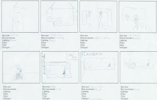
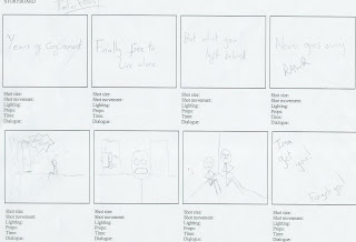
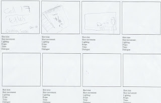
Above and to the left are our basic storyboards that we put together before the filming process, we attempted not to storyboards every shot but to get the basic idea of what we could involve. As we became more aware of our available resources as we filmed, our set shots were altered and changed significantly.
Thursday, 18 November 2010
Tuesday, 16 November 2010
Horror Film Posters
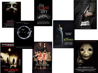 The picture to the left is a representation of typical horror film posters. Most use not much writing, not may pictures and dark colours to give a sense of death and mystery. There is normally a plain black/dark background to keep the focus on the usually scary image on the poster. There is also usually the name of the film in large print towards the bottom of the page and a tage line or outstanding quote from a newspaper etc at the top. Below the main title is usually actors/actresses names as well as the producer and director's names etc. Text is usually in white to stand out fully against the background.
Monday, 15 November 2010
Props & Costumes
In terms of props there is not that much that we need to buy, we need some fishing wire to make things move by themselves as well as some simple make up; red eye shadow etc. Costumes will be generally black so that we seem more spooky!
Set & Risk Assessment
Georgina's House - A large section of the filming was done inside, this carried no particular risks in itself apart from the fact it was dark! However, the small section of filming we did outside in her back garden carried the risk that some of the ground was very wet and slippy that we found particularly prominent in a fast moving shot! (Below - The set for most of our filming) 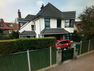
In A Car, Outside & In The Studio - Although I was not present for the three filming sessions because I wasn't needed, they carried some significant risks in themselves. Not only did we film in a moving car, which clearly carries some minor risks, we also went outside to film in a deserted private place in the dark, which could bring risks of tripping hazards as well as strangers encroaching into filming etc. The studio at college was our last set of filming, this carried no significant risks and was a safe secure environment to be filming in.

In A Car, Outside & In The Studio - Although I was not present for the three filming sessions because I wasn't needed, they carried some significant risks in themselves. Not only did we film in a moving car, which clearly carries some minor risks, we also went outside to film in a deserted private place in the dark, which could bring risks of tripping hazards as well as strangers encroaching into filming etc. The studio at college was our last set of filming, this carried no significant risks and was a safe secure environment to be filming in.
Tuesday, 2 November 2010
Original Idea Concepts & Links
As written by Louis;
A Woman lives alone in a big house; she spent all her childhood in care and suffered from many behavioural disorders. At a young age her carers had her aggression and anger removed by a ‘spiritualist’. Now that she is a reformed member of society she finds her inner child has returned in the form of a dark menacing demon girl, stalking the halls of her house.
Our film concept is about a little girl who spent her childhood in care. This girl suffered from many behavioural disorders which made her extremely aggressive and angry. Because of this she spent a lot of time in solitary confinement while the carers tried to deal with these issues. Eventually the care-home decide their only option is to use a local self proclaimed 'spiritualist' to banish the aggression within her so that she can live an ordinary life.
The experiment that is performed on her worked and she is now much older and has been allowed to move into the house that she occasionally went to to visit her parents. Her parents have since died and she is now living peacefully in her new home, establishing a new life.
However, not long after she has been in the house she begins to see strange things happen in her house and eventually an apparition of a small girl appears in her house. This girl is extremely volatile and is uncontrollably aggressive. In one confrontation she realises that the little girl is in fact her back when she was in care, with all the anger and hatred that was taken out of her in that stage of her life. The woman accepts that she cannot escape her inner child and tries to escape but the girl won't let her get away.
PLOT UPDATE: As updated by Louis;
Our initial concept of the film has had to be changed due to casting issues. Because we are unable to find a younger girl to play our main characters inner child we have decided to change the idea as such:
-The confinement cell the main character was in as a child is posessed by a demon.
-Once someone leaves the cell they soon die within their own home of unknown causes
-Every new person to leave the cell has been haunted by the posessed spirits of those to die before.
-The main character experiences poltergeist activity and sees aparitions of the past spirits in her home.
-She loses her certainty within her own home and hides in her room that changes back into the cell. She is never seen again but the ending scene shows her in the cell with all those who had been in it before, and she is dead too.
We have easily adapted our storyline to suit our storyboarding and shot concepts. Although we will have to work some more to decide what characters will be using, it will not change our idea much so we can still do everything we have already intended to do.
As written by Adam;
Our idea could be linked to Paranormal Activity 2 as this is based around a a young girl and hauntings and ghosts etc. We are not sure how similar we should make our trailer to that of Paranormal Activity 2 as the shots are fairly long and instead of going for shot shots with blood and gore and monsters, they've gone for the dark or light colours inside a house at night time where hauntings are visible. Below is the paranormal activity trailer.
Monday, 1 November 2010
Survey Results
We surveyed 15 people...
1.) Do you like to watch horror films?
Yes: 9/15
No: 6/15
2.) Gender?
Male: 8/15
Female: 7/15
3.) Age?
13-17: 9/15
18-23: 2/15
24-29: 1/15
30-39: 1/15
40-49: 1/15
50-60: 1/15
4.) Last time you watched a horror film?
0-1 Month: 9/15
Over 1 Year: 3/15
2 Months: 2/15
3-6 Months: 1/15
5.) Horror films you've enjoyed in the past? (Click on title to view trailer)
Sixth Sense (3/15)
Dracula (2/15)
Saw (2/15)
The Exorcist (2/15)
The Thing (2/15)
28 Days Later (1/15)
Alien (1/15)
Exorcism of Emily Rose (1/15)
Halloween (1/15)
Jaws (1/15)
Mirrors (1/15)
Mothman Prophecies (1/15)
Nightmare on Elm Street (1/15)
Paranormal Activity (1/15)
REC/Quarantine (1/15)
Se7en (1/15)
The Others (1/15)
The Shining (1/15)
The Texas Chainsaw Massacre (1/15)
The Wolfman (1/15)
What Lies Beneath (1/15)
6.) Types of horror films you like?
Adventure: 10/15
Slasher: 7/15
Gory/Violent: 4/15
Comedy: 4/15
Romantic: 3/15
Monsters: 3/15
7.) Blockbusters or amateur?
Blockbusters: 10/15
Amateur: 8/15
8.) How do you find out about horror films?
Word Of Mouth: 9/15
Television: 7/15
Internet: 6/15
Magazines: 5/15
Cinema: 3/15
9.) Are you influenced by trailers?
Yes: 8/15
Sometimes: 6/15
No: 1/15
10.) What do you want from a horror film?
Entertainment: 7/15
To Be Scared: 5/15
Escapism: 4/15
A Cheap Thrill: 1/15
This research was of only limited value because of the low number of responses. What was more useful was our research into the industry, new releases, box office successes and memorable marketing campaigns such as that for Paranormal Activity.
Return Of The Repressed
The return of the repressed is an idea that goes hand in hand with the uncanny. It is the main idea in many horror films. It involves the idea of people being haunted or tormented by dreams or memories and was a theory developed by Freud. Our group is interested in this idea and we are planning to use it as the basis for our idea for a psychological horror film.
Friday, 22 October 2010
Representation of Gender in Horror Films
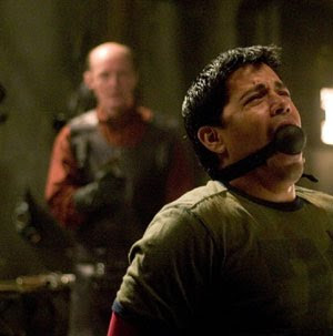
In most films, girls are stereotyped into the weak, helpless category and often it takes a strong male to protect them but in horror movies, these roles are sometimes almost reversed. In 'Tormented', although it's not the best made film ever, gender is represented in different ways. Most of the time, the males are represented as the dominant characters as they are the violent ones and try to show their authority as well as sometimes protecting the female. However, although Justine (the main female) ended up getting arrested, she seemed to be the dominant character throughout a lot of the movie. In 'Hostel' there are not really many female rules within the movie however most of the male roles require the character to be scared as they all get tormented (see left.) In Hostel II the victims are female and the film ends with the typical 'final girl'. We are planning on using the 'final girl' concept in our film as the lead character is female and she needs to battle the demons in her mind in order to survive.
Tuesday, 19 October 2010
Subscribe to:
Comments (Atom)
